DocuWare
Creative lead while working at LESS+MORE. DocuWare is a global provider of cloud solutions for document management and workflow automation. Founded in 1988, the company’s products and services have evolved to meet the changing needs of its customers. Their branding was in need of evolution as well. We were brought in to redesign DocuWare’s corporate identity and thoroughly refresh its outward appearance.
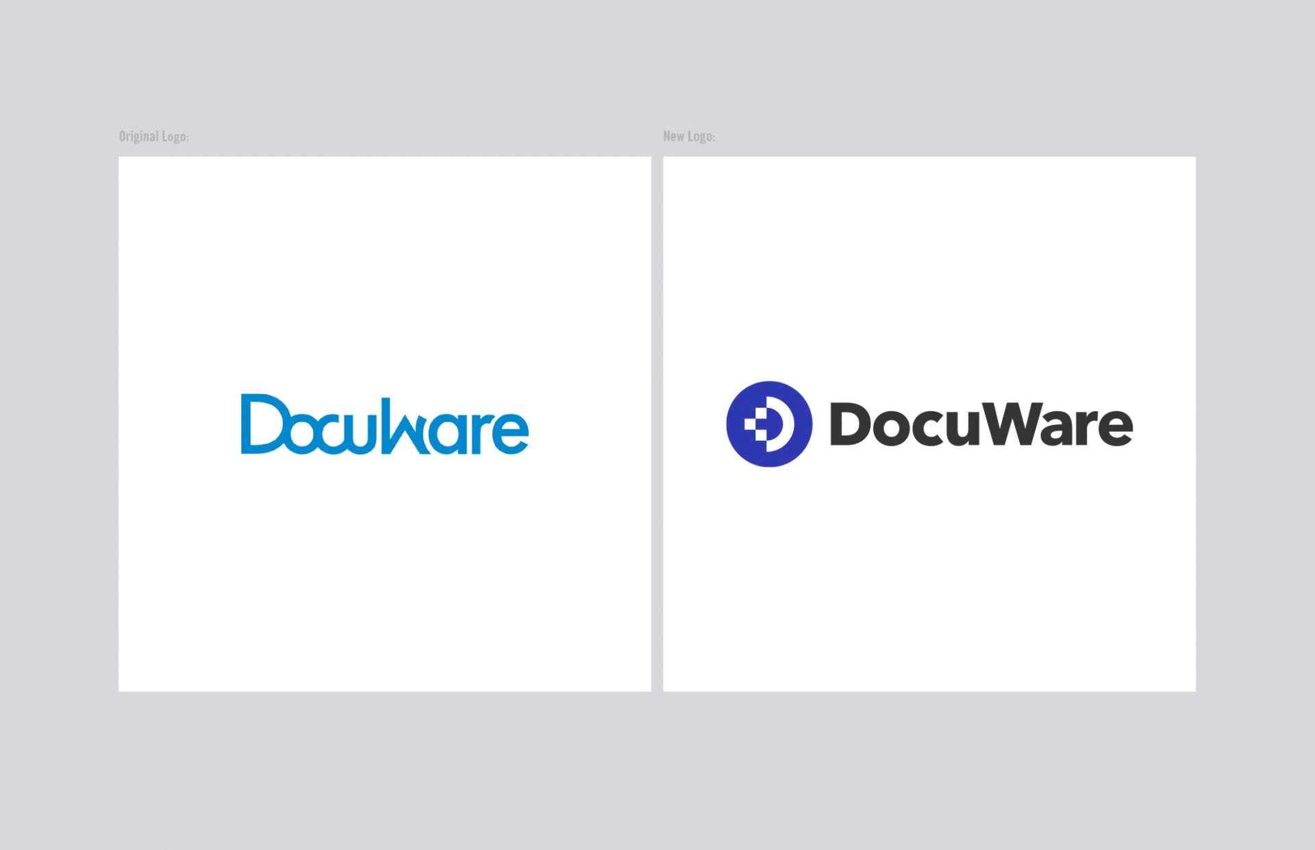
Working with DocuWare’s leadership, we established a clear plan and set of success metrics. We were given reign to explore the core brand identity elements and asked to build from the brand messaging platform of “Set the new pace for business”. Our design strategy was rooted in expressing the core brand attributes most relevant to DocuWare’s success. We applied this thinking to broad early creative exploration and presented numerous options for consideration.
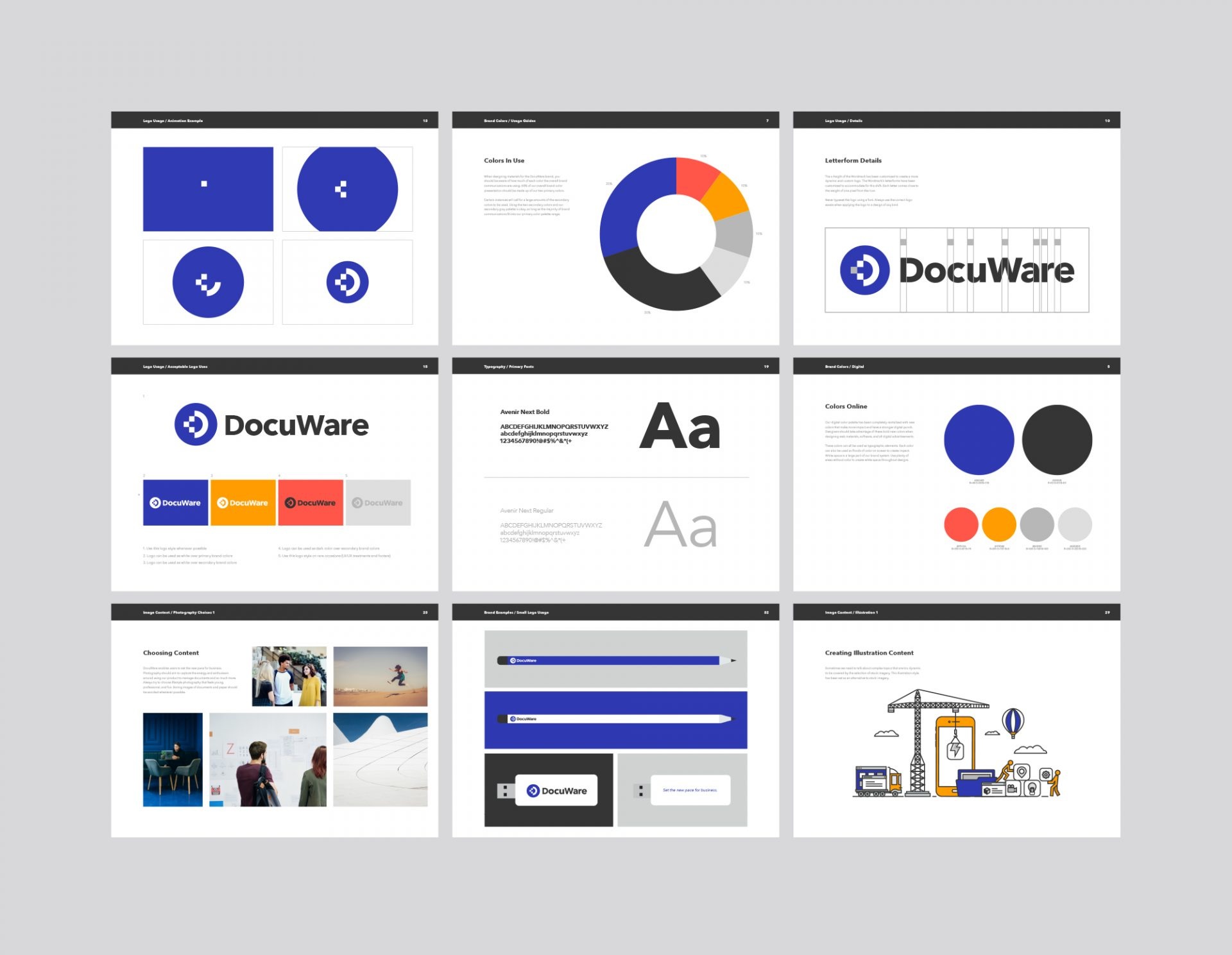
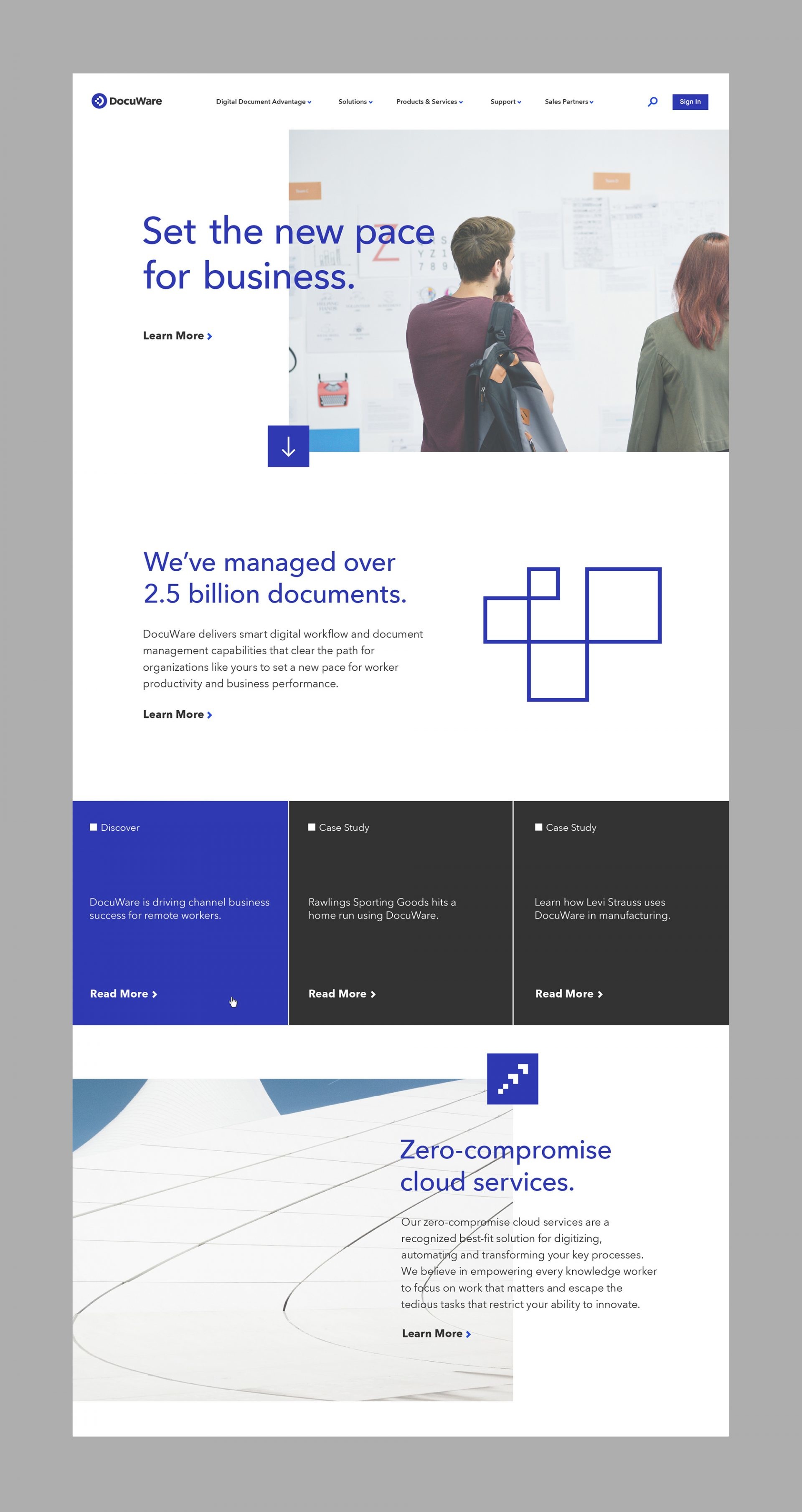
Dubbed “Pixel” by our creative team, the chosen concept moved into execution. We applied numerous subtle design variations and tried different typographic and color palette combinations. We revisited research and compared proposed solutions to competitive brands. We also stepped back to view the work critically through the eyes of the different geographic markets it would be used in and tested it on specific applications that make up DocuWare’s marketing efforts.


It quickly became apparent that this new visual platform had the cohesion and flexibility an organization needs in a brand identity. The work has been well received. Implementation has been a month’s long effort across various locations, and has included application on countless touch points.
