ScoreShuttle
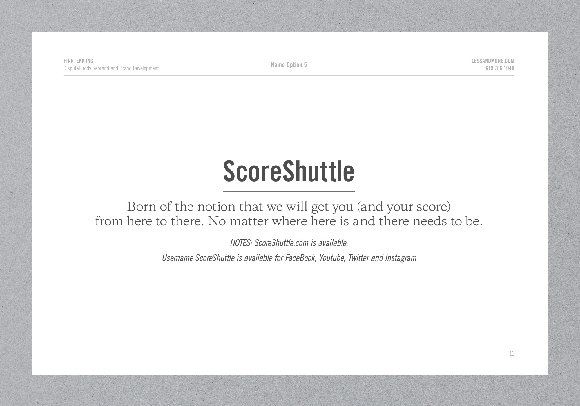
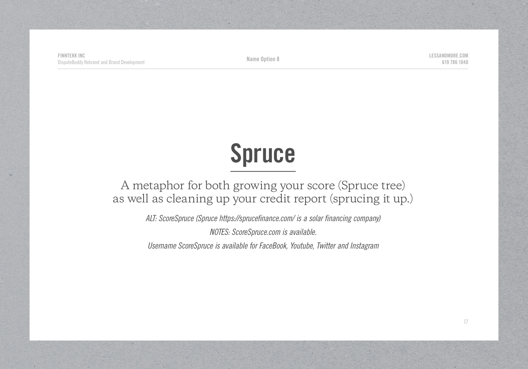
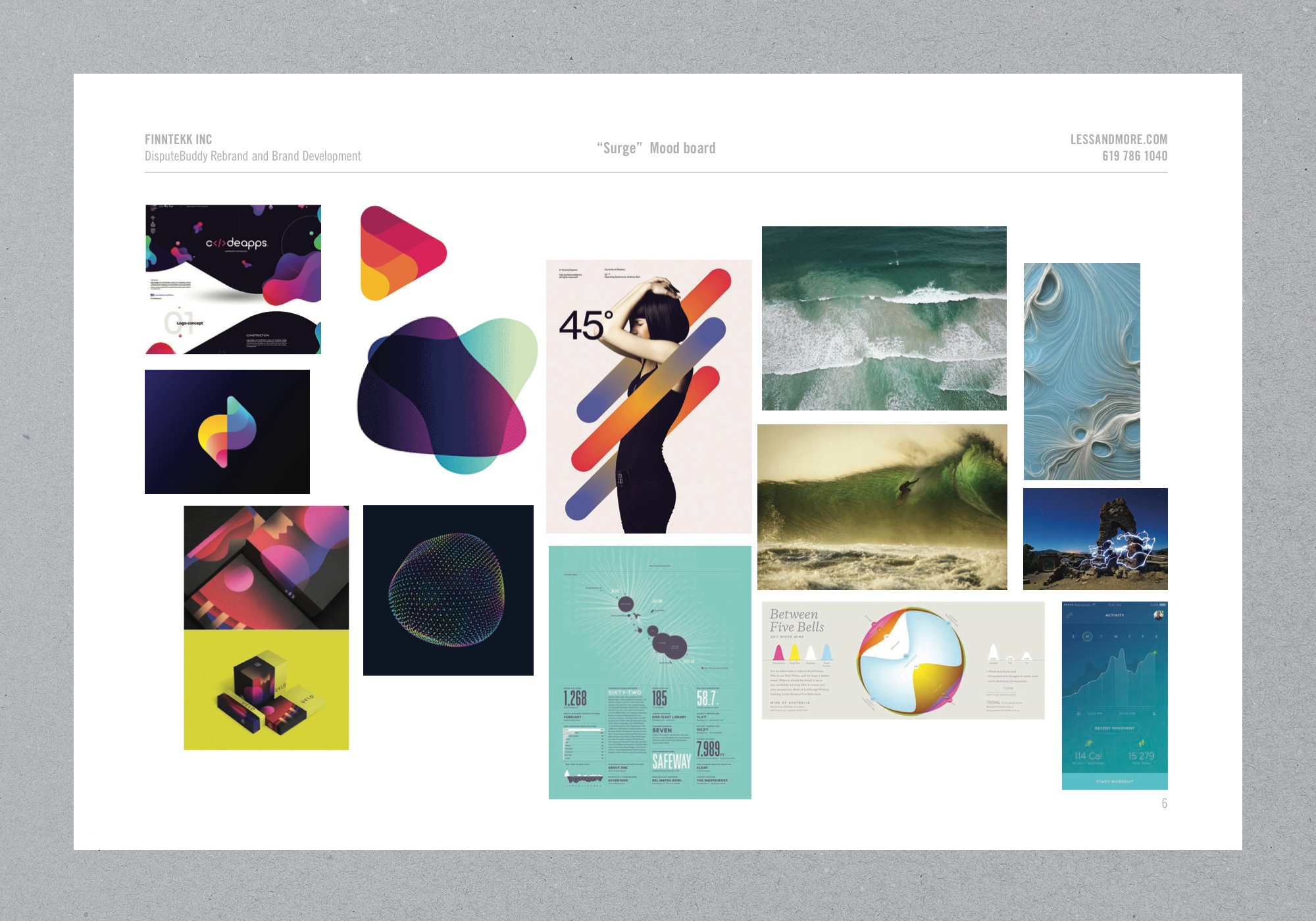
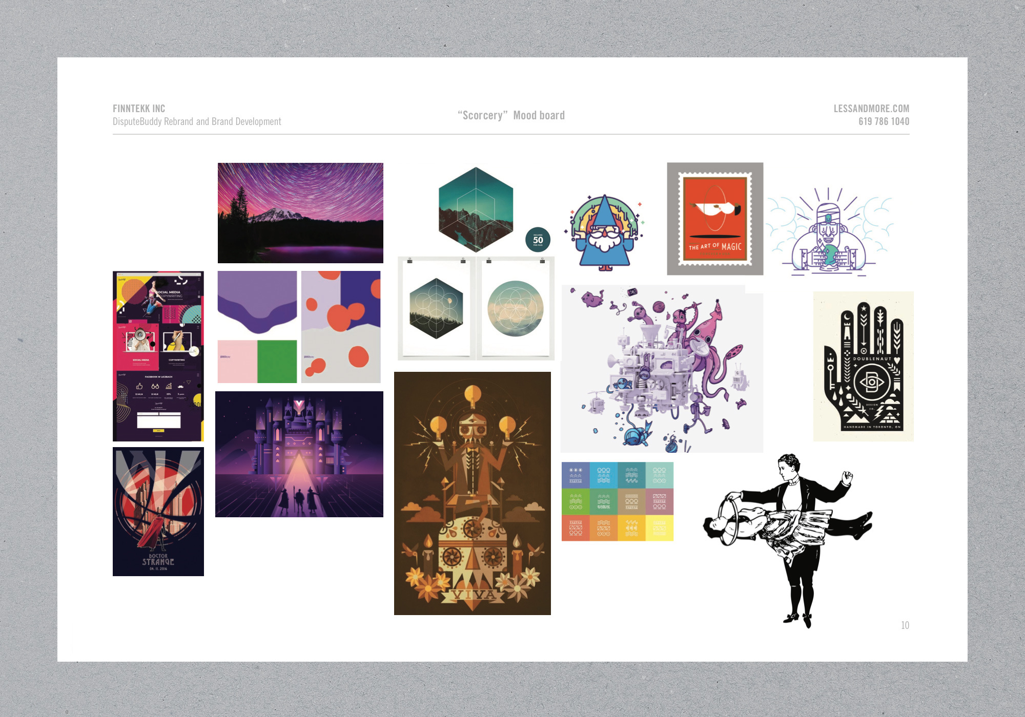
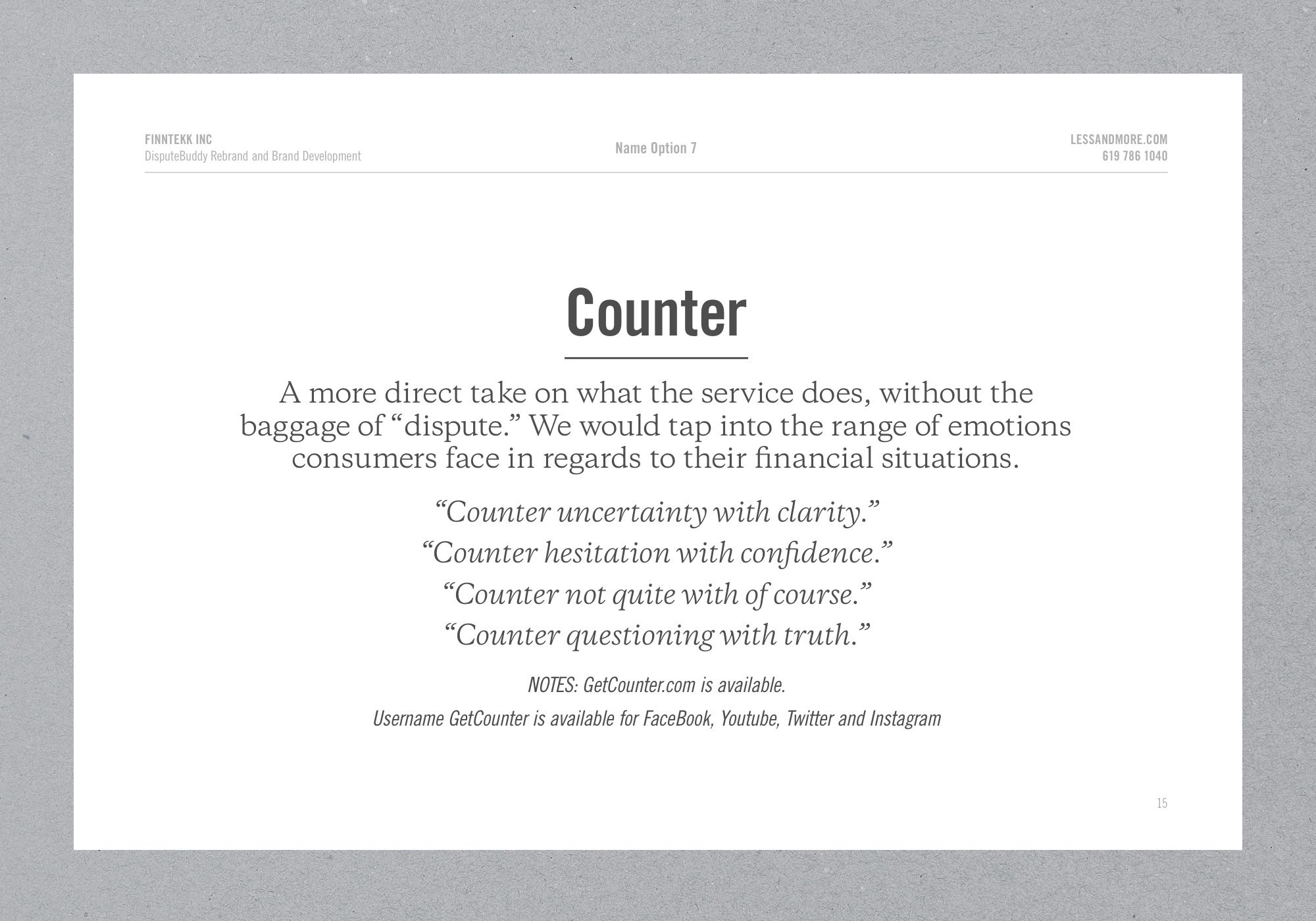
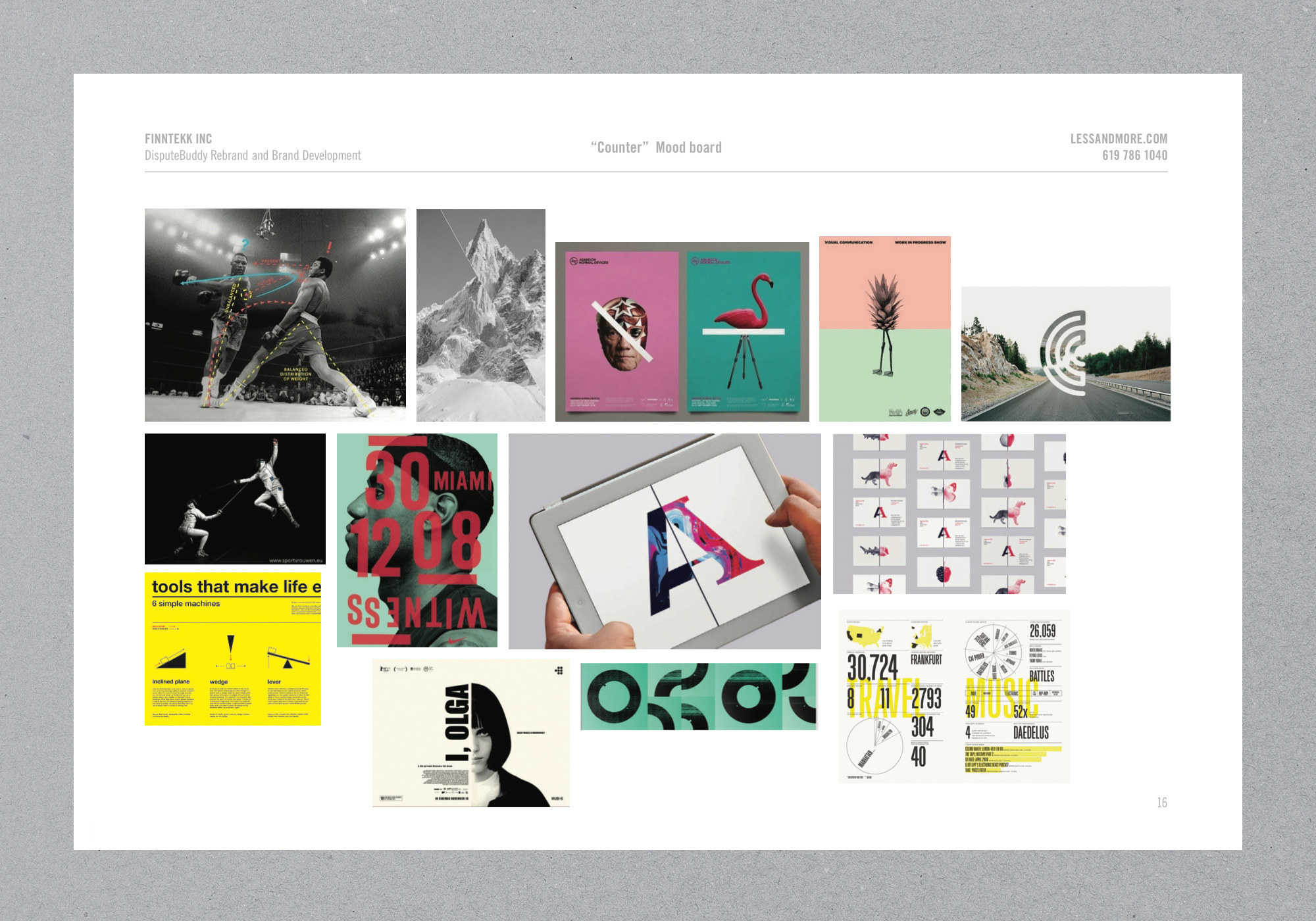
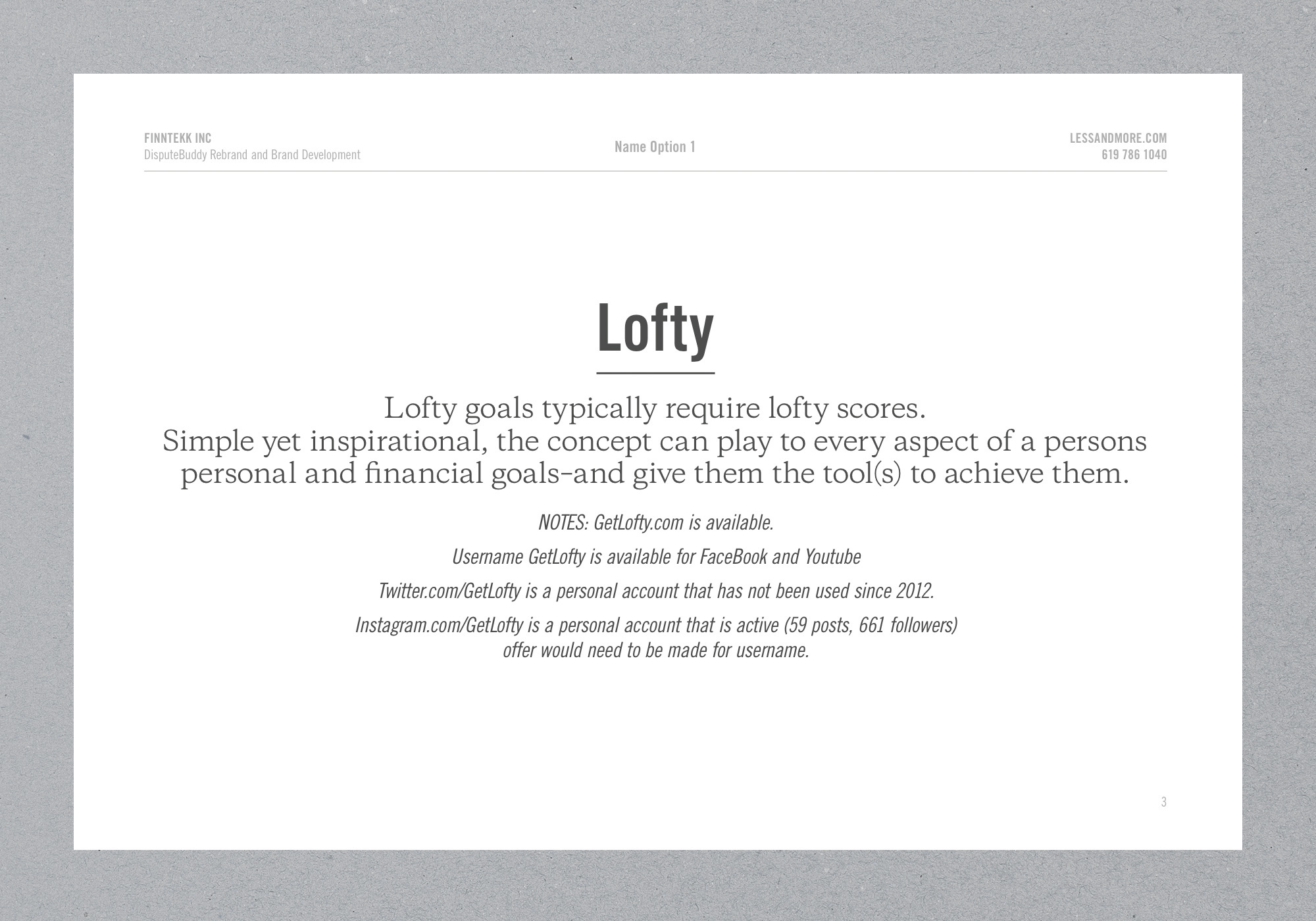
The founders came to us with an idea and the technology for an app, but not much else. This new product would provide consumers with a way to improve their credit scores. We started with naming and presented multiple approaches, each exploring a different take on what the brand could potentially stand for.
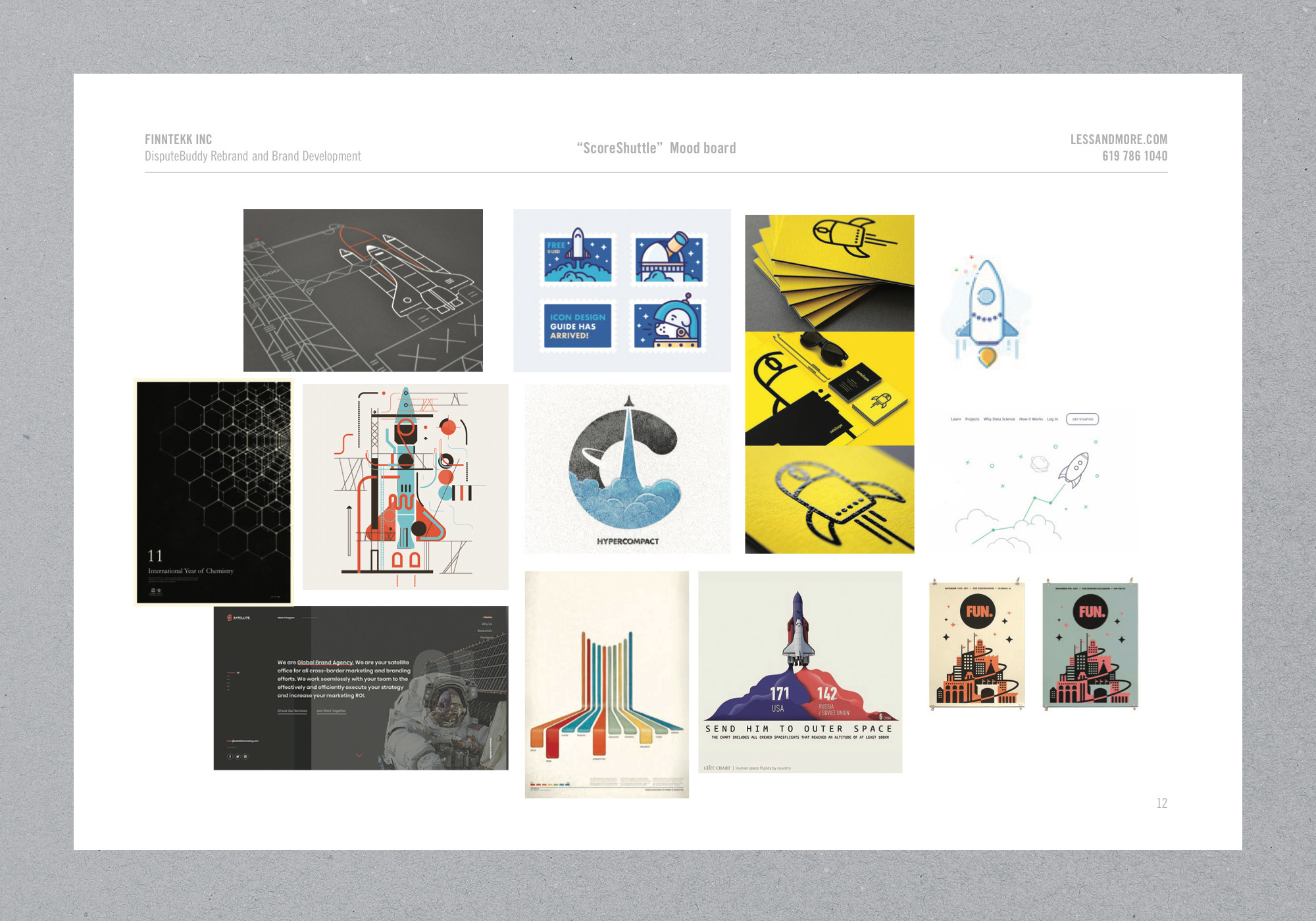
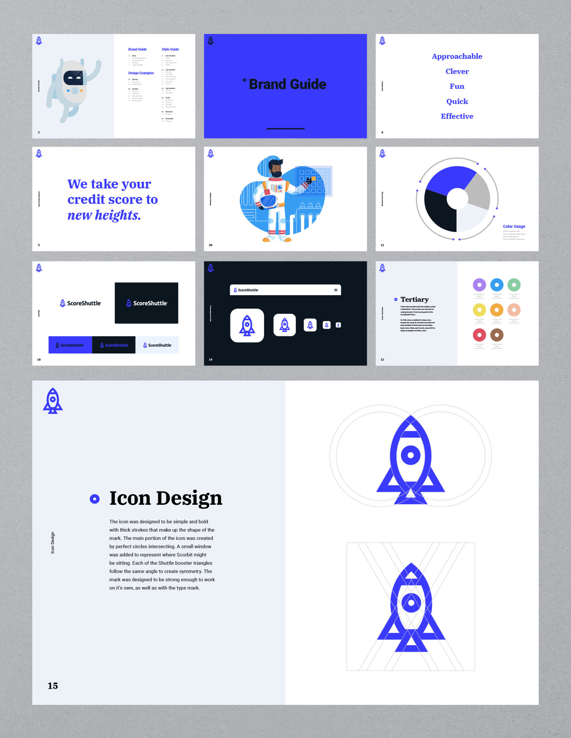
Once ScoreShuttle was selected as the name, we got to work bringing it all to life. We developed a visual and verbal brand language complete with a detailed guide book.
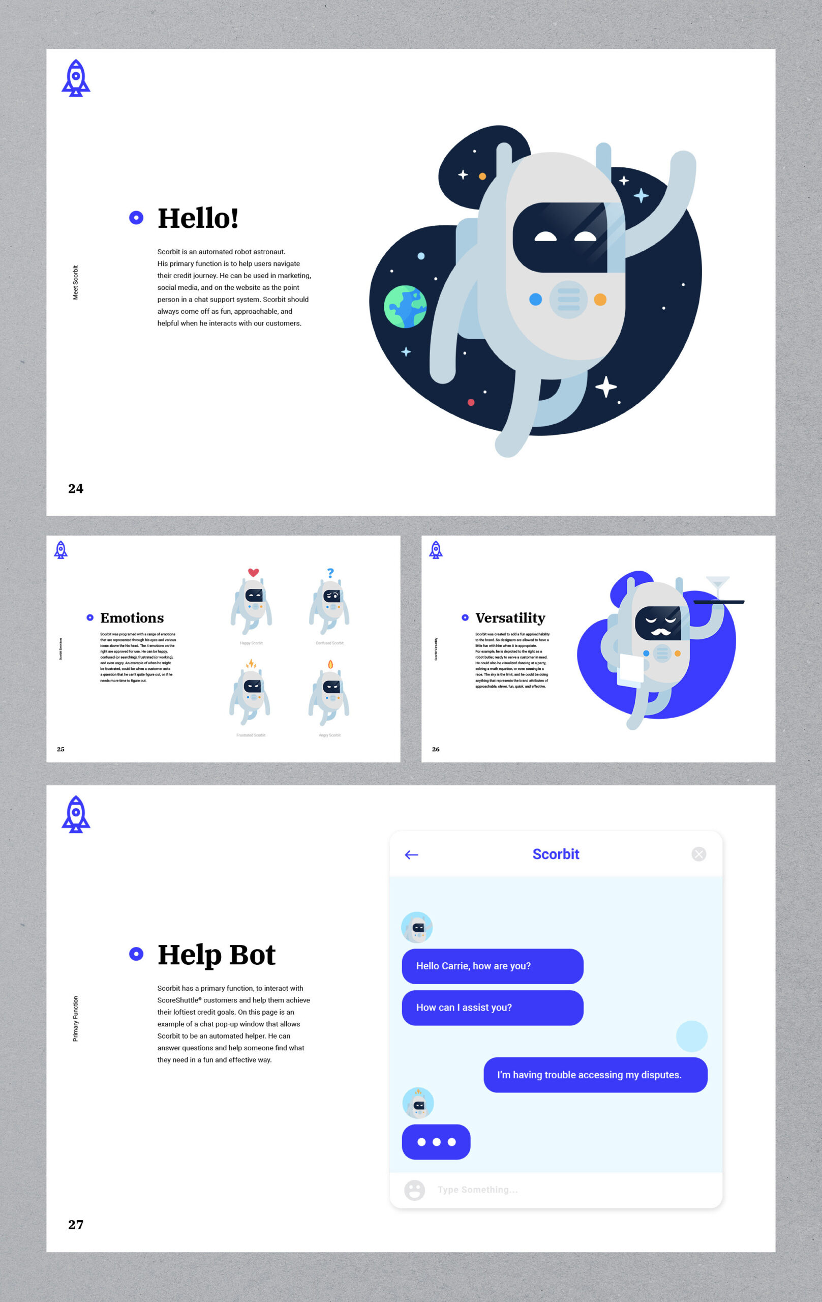
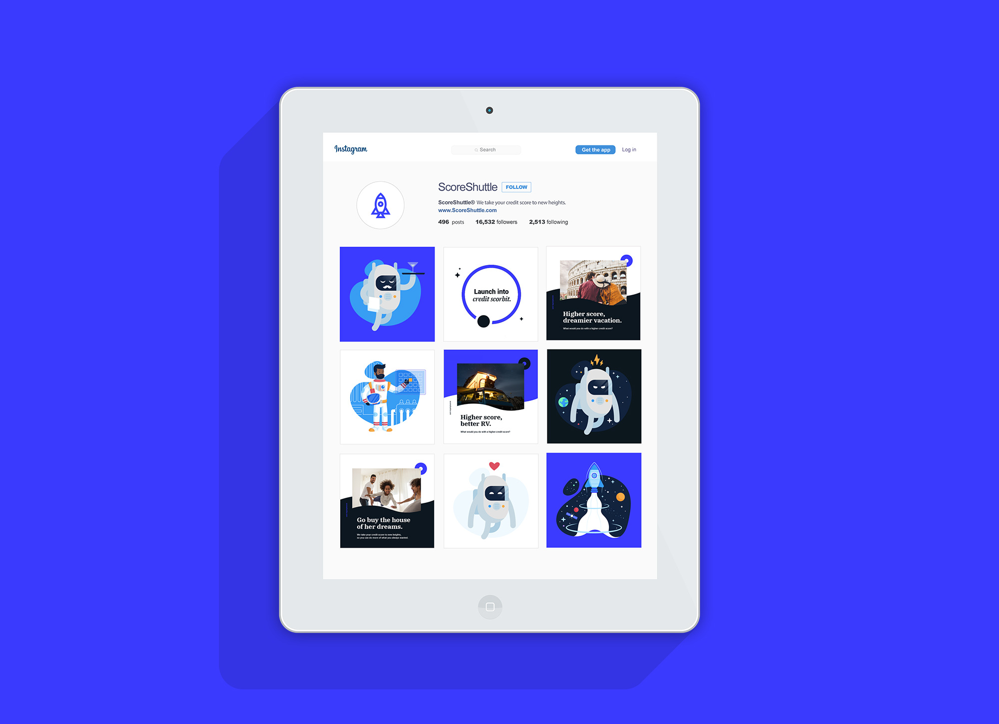
We suggested and developed a brand mascot named “Scorbit” to act as an automated help tool. The bot quickly became a beloved personification of the brand. Helping the marketing and customer service teams engage with a consistent voice to prospects and current customers.
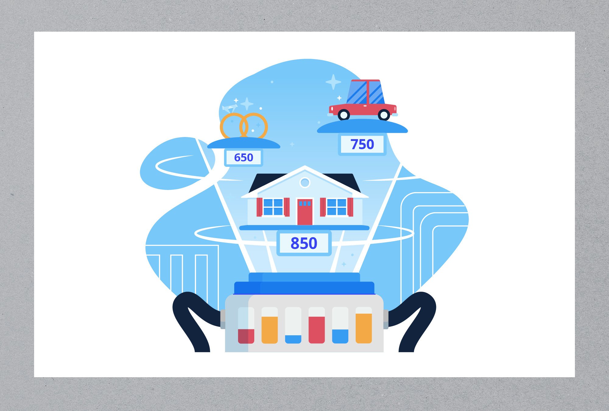
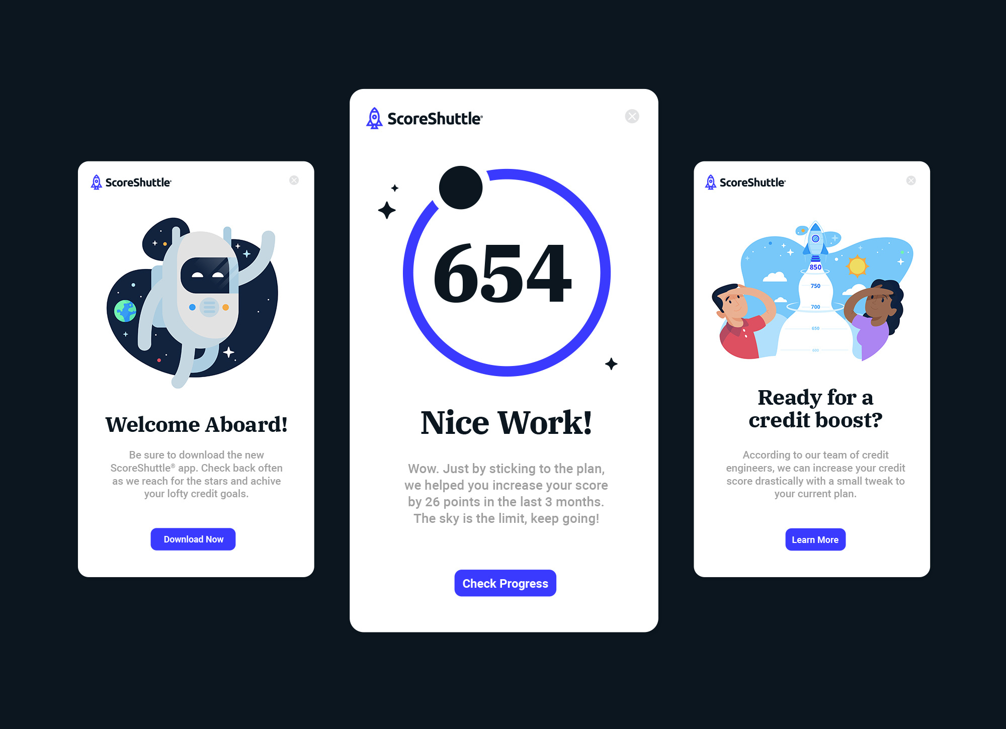
We crafted a series of space-themed illustrations to help the team differentiate at key customer touchpoints. They were created to set illustration standards that the brand could leverage. We art directed illustrator Rocky Roark on the final illustration style.
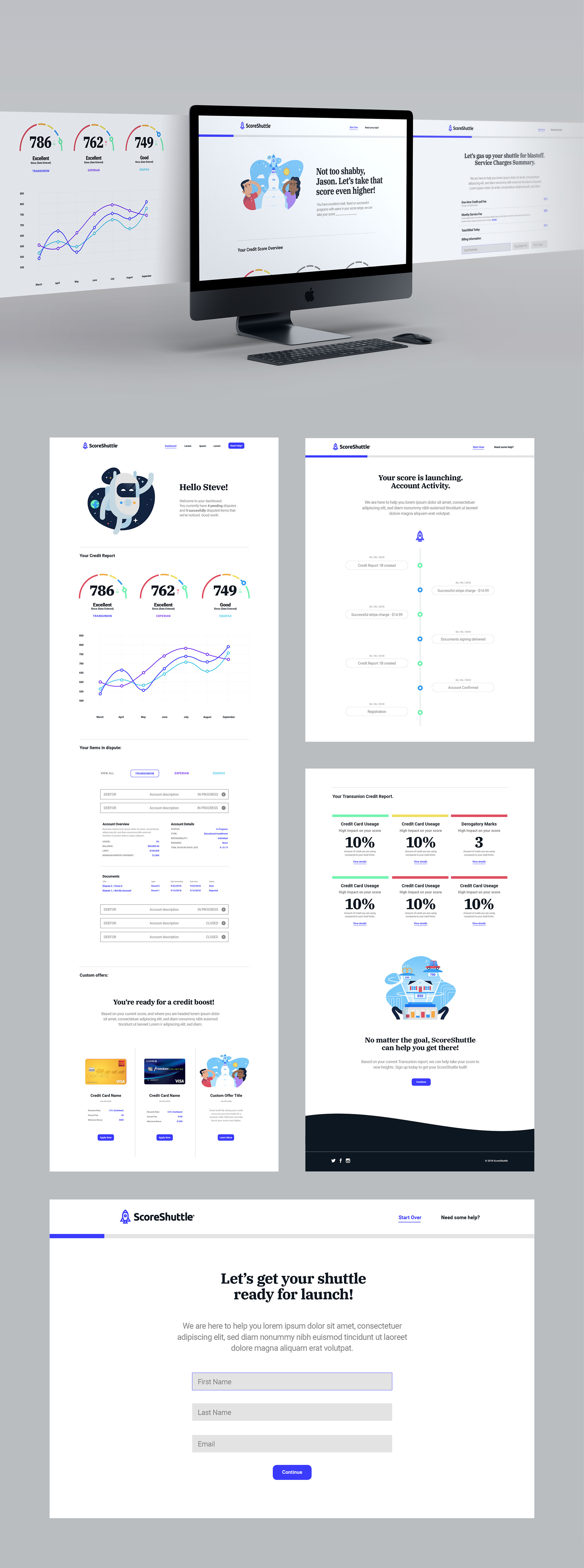
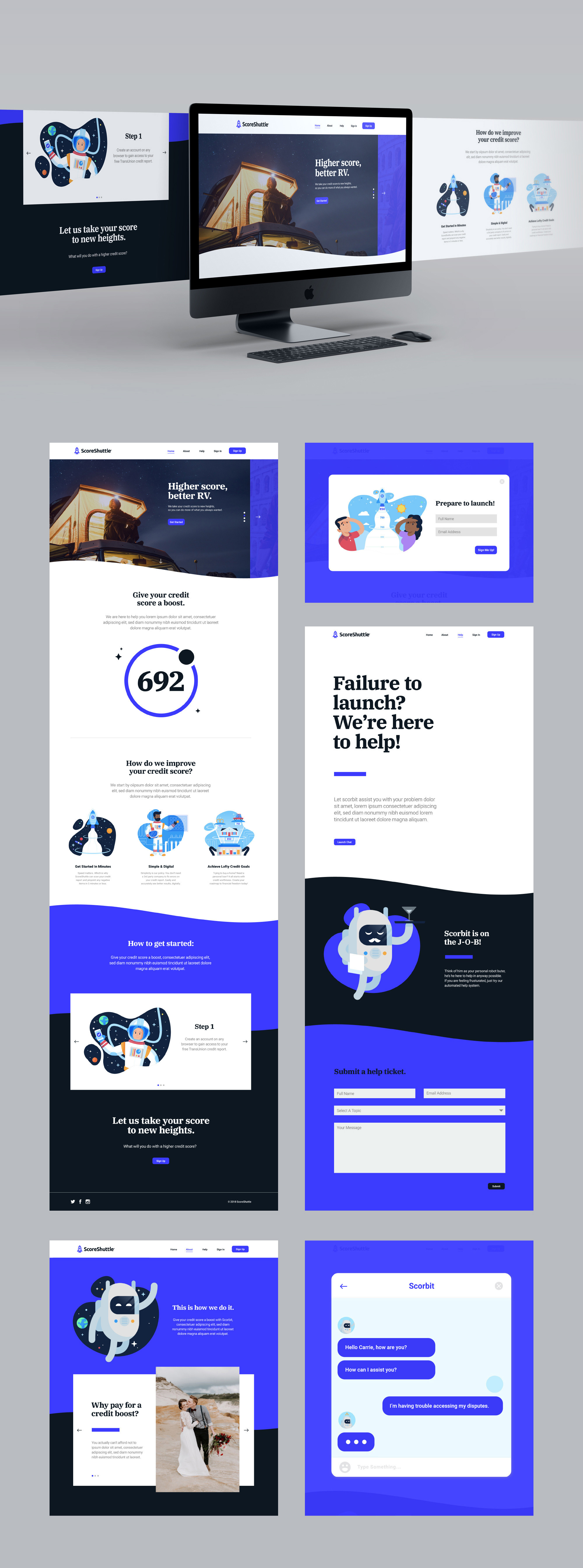
We created and launched a consumer-facing website to convey the brand’s unique offering and to support online sign-ups.
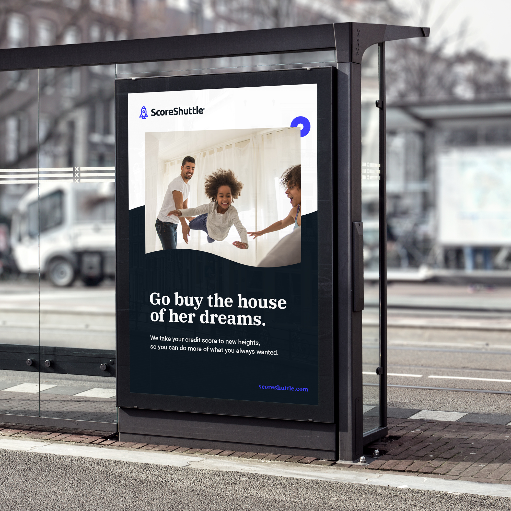
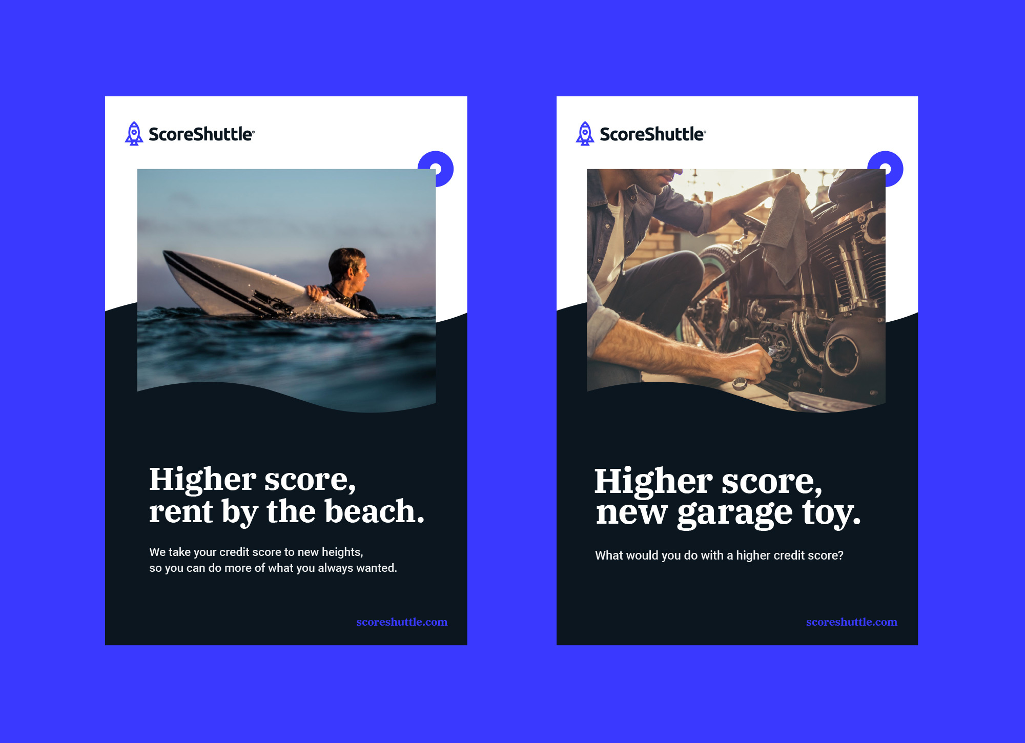
We developed email templates, branded social media profile pages, advertising templates, and a variety of other key materials.
From the sign-up sequence to the dashboard that shows members their credit score information, we developed interface designs aligned with ScoreShuttle’s new brand.
